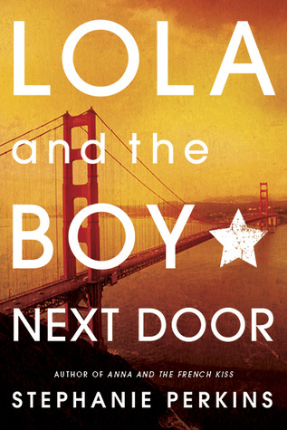
My biggest pet peeve is when beautiful HBs turn into lackluster PBs. I completely understand that publishers may choose to change the cover due to various reasons, low sales especially, but the thing for me is: I don't buy new hardcover books. Ever. I can't afford them and I just simply prefer soft covers. Trade PB has always, and will always, been my preferred format. So when I'm salivating over a HB cover only to have it change before it comes out into PB it makes me CRAZY. Publishers would probably make MORE money on PB sales if they kept the amazing HB covers!
So I stand by my title for this post:
Why, Publishers, Why?!
Today's Pick:
Lola and the Boy Next Door


My buddy Pam mentioned this series last week. This book was on my list of books for this feature, so I decided to showcase it this week. Ok, hear me out here. I don't hate the PB version of this book. I quite like the Golden Gate Bridge--I just GREATLY prefer the HB cover of this book. To begin with, it is just so charming. The color scheme is great, Lola and Cricket look like how I imagine their characters, the font has the perfect amount of whimsey, the houses in the background are exactly what I picture when I think of San Fransisco. In short, everything about the HB is perfect which makes me sad for the cover change. Again, I don't HATE the PB, but it is pretty boring when the story inside is so cute and charming.
I imagine I'm going to be in the minority this week. I actually prefer the PB version of Anna, and I have the PBs of both books, and will definitely buy Isla when it comes out in PB next year sometime, but I really do prefer the HB of Lola.
Which one do you prefer? Do you like both or not like either? Sound off below!


I bought both of the paperbacks in the series and I adore the covers. I just love how gorgeous they look next to each other (I'm excited to get Isla as well). I'm not too fond of the old hardbacks, maybe it's because I saw them in paperback form first though. I'd love if they would put the new pb versions into hb.
ReplyDeleteI like the yellow one best. x) Usually I'm not fond of remakings and I think the yellow one is almost a littttttle too generic....BUT. I'm not fond of people on covers, so it's the yellow for me! XD
ReplyDeleteI must admit I don't like people on covers so I prefer the bridge one. However both are a lot better than the cringey Anna covers! I'm listening to Lola this week on audio and I love it, it's just so cute :)
ReplyDeleteI do love the new covers (especially because I really hated the HB of Anna) and while I do like the new Lola one, I do kind of prefer the HB, I mean, it just looks so freaking cute, which you don't get from the PB. It does look pretty boring next to it. :/
ReplyDeleteI actually much prefer the new one on this title. I haven't read the series yet, but the first cover is a bit cheesy and would make me hesitate to pick it up.
ReplyDeleteI'm torn on this one, but there is something about the new covers that just look more sophisticated or something. I usually like covers without people on them, though. ~Pam
ReplyDeleteI don't mind new covers, but when they don't make the old versions for the new books it really sucks! Now, all the people with the old covers can't do anything about it. :'(
ReplyDeleteI like when covers get variations, but sometimes, they can kill a book. The Daughter of Smoke and Bone got horrible covers when they updated the design. It made me so mad.
ReplyDeleteHB for me. It's more telling of the story.
ReplyDeleteI definitely prefer the HB cover for this one. I have a weakness for purple hair plus I think it gives a better idea of what the story's about. I luckily happened to find a HB copy of this book for three bucks.
ReplyDeleteUgghh i completely agree! I have the PB of Anna and the HB for Lola, and I have to put Lola first or otherwise it looks bad. I just got Isla but its the biggest of the 3. Oh well :)
ReplyDeleteNemo @ Blame it on the Book
I actually really like the new covers, but that doesn't mean I love the old covers any less. They just had more character. I now own both because I am weak and could not go on without them...and I wanted them to match Isla when she arrives. :D
ReplyDeleteI never really jump for covers with actual people on them! I think it ruins slightly the fun of imagining the characters for yourself. And I always think covers with people on them look slightly like low-budget movie posters ^_^ But I did love love love this book
ReplyDeleteI love the HB cover more and I was actually very surprised when I read that some people didn't pick up this series because they thought the covers are super cheesy. I, on the other hand, think that the new covers are waay cheesier, especially Anna's new cover with that big ass heart and pink color, horrible.
ReplyDeleteI'm glad we agree on this one. :)