


So a couple of weeks ago, I did a discussion post about horrible cover changes. I loved putting it together, so I've decided to just go ahead and make it a regular feature.
My biggest pet peeve is when beautiful HBs turn into lackluster PBs. I completely understand that publishers may choose to change the cover due to various reasons, low sales especially, but the thing for me is: I don't buy new hardcover books. Ever. I can't afford them and I just simply prefer soft covers. Trade PB has always, and will always, be my preferred format. So when I'm salivating over a HB cover only to have it change before it comes out into PB it makes me CRAZY. Publishers would probably make MORE money on PB sales if they kept the amazing HB covers!
So I stand by my title for this post:
Why, publishers, why?!
Today's pick:
Imaginary Girls by Nova Ren Suma
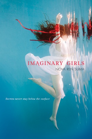

I love the HB version of this cover. The color of the water, the red ribbon/hair, the angle. Everything about it is amazing.
Conversely, everything about the PB is hideous. The huge floating head, her fake green eyes, the way it looks like a vampire book. Just, boo!
Which one do you prefer? Do you like both or not like either? Don't you think the PB looks like a vampire book? Sound off below!


Ugh to that paperback. It looks so badly photoshopped. Why would you chance it from that gorgeous underwater one?? It's so eye-catching and whimsy and beautiful! I'm agreeing with you here!
ReplyDeleteOh, wow…you are right! It does look just like a vampire book. I definitely like the HB version as well….much better!
ReplyDeleteI think the hand hanging out of the boat is cool but otherwise I'm kind of meh about both covers. I do agree that the red ribbon mixed with the red hair is a great effect though, especially against the blue water so I'd have to go with that one too.
ReplyDeleteI'm not really a fan of either of them. Although, of the two, I do prefer the HB edition better. I don't think the other one looks vampiric, but I do think it looks very cheaply photoshopped.
ReplyDeleteI prefer the HB cover. I thin it matches the story itself better.
ReplyDeleteLOL I posted today on the same topic, but different books. I SO agree that the original IG cover is better. And in my post I also bemoan the fact that beautiful, original covers often replaced with generic covers.
ReplyDeleteI'm with you: whyyyy??
Jen @ YA Romantics
Yay so happy you'e decided to do this regularly! I love posts like these! And I'm so with you on the hardback cover. It's SO much nicer. It's so interesting and haunting and though I haven't read the book yet, the cover makes me want to read it! The paperback is just blah in comparison.
ReplyDeleteI feel your pain, Natalie! The hardcover is so much nicer, and I am not a fan of the paperback cover at all. Now that you mention it, it does sort of look like a vampire book or a paranormal romance. And it's just too dark compared to the bright colors of the hardcover. I just don't understand why they would change that pretty cover. How frustrating! This is a great idea for a feature! Great post! :D
ReplyDeleteI definitely like the hardcover a lot more than the paperback, but really I haven't had an awful lot of experience with books covers changing when they go to paperback- when books have a cover overhaul mid series, whilst I don't believe it's affected any books I own, that can be really frustrating!
ReplyDeleteFloaty heads on covers just make me laugh. The HB one looks so dreamy and soft, but the PB one just looks... Laughable, almost.
ReplyDeleteOh, publishers. :(
I don't hate the paperback but it totally does remind me of a vampire book. Plus, the hardback is just way way prettier! Totally don't see the point in making them different.
ReplyDeleteI totally agree, the HB version is beautiful, with how her hairs floating oh so prettily. But the PB cover juts looks tacky, fake and photo shopped. What I hate more though is discreet changes, when books in a seris don't match, but can't pass as standalones. Man, I hate that!
ReplyDeleteGah, this is really becoming a problem, isn't it? I'm glad I have the hardcover of this one because I DETEST that PB. The original cover was just so stunning...part of what drew me to the book in the first place. But that PB cover is definitely reminiscent of a bad vampire book.
ReplyDeleteBTW, I'm loving this feature. :D
Totalllllly agreeeee! The hardcover is amazing, and the PB is just bad Photoshop. Seriously, how did it get approved!?!?
ReplyDeleteAgreed. Do not like the paperback. Also, I feel this way about all of the new Wolves of Mercy Falls covers (Maggie S.) and Charm & Strange. I love the hardcover covers and I get so sad looking at the paperbacks. oh publishers. Why you guys so silly??
ReplyDeleteI never thought about it before, but it does really look like a typical vampirey book! It's sad when they go from something so gorgeous and unique to some like that! :(
ReplyDeleteI really don't like it when they change the covers, either. Sometimes, like with Imaginary Girls, the new cover looks horrible. I could imagine myself getting the hardcover based solely on the cover if I saw it in a bookstore, but I would barely glance at the paperback.
ReplyDelete