


My biggest pet peeve is when beautiful HBs turn into lackluster PBs. I completely understand that publishers may choose to change the cover due to various reasons, low sales especially, but the thing for me is: I don't buy new hardcover books. Ever. I can't afford them and I just simply prefer soft covers. Trade PB has always been my preferred format. So when I'm salivating over a HB cover only to have it change before it comes out in PB, it makes me CRAZY. Publishers would probably make MORE money on PB sales if they kept the amazing HB covers!
That's why I call this post:
Why, Publishers, Why?!
Today's Pick: Salt & Storm by Kendall Kulper

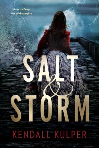
This is yet another book I've been patiently waiting to come out in paperback only to go: what?! The paperback cover looks SO fake! Like, my 10 year-old niece was playing around with photoshop fake. I love the simple, nautical look of the HB, and I love the typography of the HB. This cover change makes me sad.
I also have to say that BOTH of these covers lose to what I'm pretty sure is the English cover of this one:

I also have to say that BOTH of these covers lose to what I'm pretty sure is the English cover of this one:
I think I'll try to track down this version instead...
Which one do you prefer? The HB or the PB? Neither? The awesome, why can't this be the American version? Sound off below!


Aw, this one makes me sad. It looks so ordinary now. I agree...the UK edition trumps them all.
ReplyDeleteooh, I love that UK version. I don't hate hate the pb but I do think the HC was a stronger cover. The PB looks like a lot of other books.
ReplyDeleteThat is a shame. I love the original cover. It was one of my favorites of the year. I wonder why they went ahead and changed it to something so completely different. Frustrating!
ReplyDeleteThe redesigned cover (with the girl on the front) is so damn.....generic! I would NOT ever pick up that book due to the cover.
ReplyDeleteOh that English cover is AWESOME. I'm sad to see the paperback cover is so forgettable. I like ones that are different and the more and more I see the girl with her back turned, usually in a pretty if not fancy dress, makes me want to NOT read it. Sigh.
ReplyDelete