
My biggest pet peeve is when beautiful HBs turn into lackluster PBs. I completely understand that publishers may choose to change the cover due to various reasons, low sales especially, but the thing for me is: I don't buy new hardcover books. Ever. I can't afford them and I just simply prefer soft covers. Trade PB has always been my preferred format. So when I'm salivating over a HB cover only to have it change before it comes out into PB it makes me CRAZY. Publishers would probably make MORE money on PB sales if they kept the amazing HB covers!
That's why I call this post:
Why, Publishers, Why?!
Today's Pick:
The Winner's Curse by Marie Rutkoski

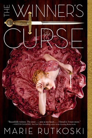
The Winner's Curse by Marie Rutkoski


I know this isn't THAT different, but that is the issue! The best part of the HB is the way in which she is holding on to the R. So pretty! Also, I have to say that I prefer the muted colors of the HB. Her blond hair looks weird that bright on the PB. I've been waiting for this to come out in PB (March 3). I read the ARC, but need a finished copy. I'm super bummed about this change.
Which one do you prefer? The HB or the PB? Neither? Sound off below!
Which one do you prefer? The HB or the PB? Neither? Sound off below!


The HB cover looks so much better. And you're right, her hair just looks so weird on the PB, overly bright and saturated.
ReplyDeleteCora @ Tea Party Princess
I hate the ever changing bookcovers! I get really annoyed when I can only get my hands on a lacklustre cover. Like you, I never buy HB because it is too expensive and takes up too much room on my shelves.
ReplyDeleteI do love how the title is the whole length of the HB cover. While I do like the typeface and sword on the PB, that hair and the saturated colours overall aren't great. I hate when the covers change. I understand costs wise but they are a bit lack lustre. Lauren Kate's Teardrop was another example for me!
ReplyDeleteI definitely like the HB cover as well. I think her face looks a little too weird and too prominent in the new cover. I read this book and really enjoyed it…glad you did as well!
ReplyDeleteUgh nooooo! The HB is perfection; why would you change it?!
ReplyDeleteEEK, NO. THAT CHANGE IS HIDEOUS. WHAT IS HER HAND EVEN DOING???
ReplyDeleteI adore the hardback version, and I have no idea why they would change it. It's perfection. I definitely agree with you about the colours. It looks much better muted. And again: THAT HAND.
I agree, the hardback one is better. And yes, why make the change at all but especially when it's so subtle? Doesn't make sense to me at all. What I hate is when they change the covers mid-series so then they don't match. I don't know if it happens at much for the paperbacks but it happens all the time for hardbacks (which is what I buy when I love the book). Just a few that I can think of off the top of my head: Shades of London series (first book completely different from the rest); Shatter Me series (same thing); Throne of Glass (same thing). So you have one book where the cover looks one way and then the whole rest of the series matches. Ugh! ~Pam
ReplyDeleteI had not seen the paperback yet, I agree I do really prefer the hardback! I actually had not even noticed that she is holding the R. It is subtle but great.
ReplyDeleteAshley @ The Quiet Concert
hard to believe I am very happy to be joined commented here, it makes an experience for me reynaldo
ReplyDeleteobat radang amandel herbal
pengobatan tradisional sipilis
obat kuat pria ereksi tahan lama
obat tbc paru herbal
obat maag akut herbal
after reading the information turned out to be very interesting, continue continue gan
ReplyDeletegood luck,always success awaited next posting steady proceed
cara alami meneymbuhkan bronkitis
cara alami menyembuhkan cacar air
cara alami menyembuhkan mioma uteri
obat klep jantung bocor herbal
obat tradisional gula basah
obat jantung koroner herlbal
obat amandel herbal
pengobatan kram usus herbal
obat penghancur batu ginjal alami
obat tradisional hipertensi
obat tradisional gagal jantung kongestif
obat tradisional diabetes insipidus
pengobatan tradisional ejakulasi dini
obat herbal pengecil perut buncit
pengobatan tradisional batu empedu
pengobatan tradisional penyakit liver
cara alami menurunkan darah tinggi
obat penurun asam lambung
obat herbal radang lambung