


 The Grass is Always Greener
Is there anything worse than seeing a drop-dead beautiful cover only to find out that it is from another country? (Ok, yes, there are way worse things, but can we all agree that it is at least a little heartbreaking?) Like my Why, Publishers, Why?! posts this won't be a weekly feature, but every once in awhile I'm going to be focusing on beautiful covers I covet but can't have because I don't have the money I spend on books as it is, let alone books from other countries that come with international shipping charges (yet...I will be rich someday...right?).
Today's focus: Uprooted by Naomi Novik
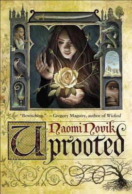
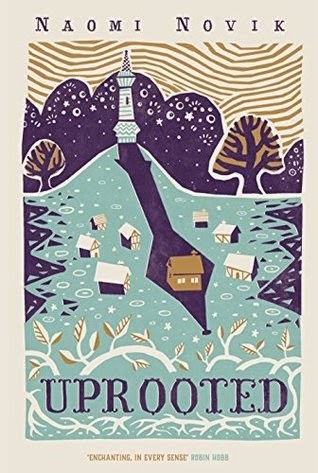

I don't hate the US cover (left or first, I guess, depending on the size of the screen you're viewing this one). In do, in fact, quite like it. I love the font used, the tree with the branches spreading throughout the cover, and the fact that the pictures are in the windows of the towers. It's a lovely cover. It just cannot compare, in my opinion, to the awesomeness that is the UK edition (middle or second). I'm seriously in love with this cover and have been since I first laid eyes on it and jealously sunk in. I love everything about this UK cover, but I especially love the way the one house is in the long shadow of the tower. This may be one international edition I eventually find a way to own. To make things even more interesting, look at the PB edition that comes out in the UK this May (right or third). I wants this version as well!
Like always, I'd love to hear from you! Which cover is your favorite?
Like always, I'd love to hear from you! Which cover is your favorite?


I love this feature, Natalie! I sprung for the UK edition from BookDepository. I love it so much---all the gold accents that you see ( the sky and houses and leaves) are done in a embossed shiny foil. It's so pretty. Not to be an enabler---but you need it. ;)
ReplyDeleteMy favorite is the middle one! It's so pretty and me wants! Though I do like the other two as well, just not as much.
ReplyDeleteThis is a great new feature! I really like the middle one. It's so pretty. :)
ReplyDeleteKrystianna @ Downright Dystopian
I own the middle version, buuuut I REALLY like the US one too!! It looks like an old, classic fairy tale?!?! SO MUCH LOVE.
ReplyDeleteThanks for stopping by @ Paper Fury!
I like your new feature! I would have to agree with you...I like the UK covers much more. I find myself gravitating to many UK covers over US covers...not sure what this means.
ReplyDeleteI have found a lot of people prefer the US cover because they think it looks more stereotypical 'fantasy cover' but I'm like you, I prefer the UK cover, which is good because that's where I live. I recently saw the new UK paperback cover and it is one of the few times I'm actually contemplating investing in a second copy, it's stunning.
ReplyDeleteI'm glad that, for once, it's the UK cover which is prettier because I normally find myself preferring the US covers for books and then end up paying extra to get it.
I actually like the US edition, because each is a part of the story, but that PB UK one is a REALLY close second. Like, might end up buying that.
ReplyDelete