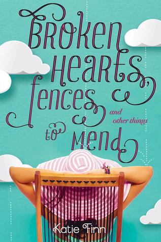
My biggest pet peeve is when beautiful HBs turn into lackluster PBs. I completely understand that publishers may choose to change the cover due to various reasons, low sales especially, but the thing for me is: I don't buy new hardcover books. Ever. I can't afford them and I just simply prefer soft covers. Trade PB has always been my preferred format. So when I'm salivating over a HB cover only to have it change before it comes out in PB, it makes me CRAZY. Publishers would probably make MORE money on PB sales if they kept the amazing HB covers!
That's why I call this post:
Why, Publishers, Why?!
Today's pick: Broken Hearts,Fences, and Other Things to Mend
Today's pick: Broken Hearts,Fences, and Other Things to Mend


WTF is this!?! I can't. I can't even. This is the most inexplicable cover change I have ever seen in my life. LOOK at the HB cover. It is flawless. FLAWLESS!! The cutesy clouds, the hat, the colors, the typography. Everything about it is magical. WTF is this PB?! I just. What is this? It's like the publisher asked, how can we make the worst cover ever? I know, let's make the whole thing a garish pink and put a broken sucker on the front. Yep, sounds good. People will totally buy this. If I were the author of these books (who seems like lovely gal), I would be pissed that they did this to my book. I can't even type anything else about this, my blood pressure is going up.
Which one do you prefer? The HB or the PB? Neither? Sound off below!


LOL, yup, that's pretty bad. And what's with the font? It's like they liked the idea behind the hand-writing font on PS I Love You, only it went horribly horribly wrong.
ReplyDeleteI think this is one of the most ridiculous books I've ever read so maybe I'm biased, but I think the PB cover does much better justice to the book. I like the font better on the original, but that girl in that ugly hat (I can't picture any of the characters in the book wearing that) just never fit for me.
ReplyDeleteI agree. This book was such a guilty pleasure/beach read and the first cover captures that so much better. The new cover is hideous...completely agree. I wonder why they make changes to covers that are pretty much perfect. It's a shame, really. T
ReplyDeleteWoof, that is quite a bad cover change!! I think my least favorite part is lollipop! Why?!?!?
ReplyDeleteAshley @ The Quiet Concert